
Graphic Design
Cuba Oaks – Graphic Design
Social media
Graphic Design

Branding Concept
Starting with just "symbolic, viral, and emo," I embarked on a branding journey for an airline, grappling with the intriguing challenge of creating an emo-themed airline. My aim was not to delve into the depths of emo culture but to capture its visual essence. This led me to craft a color palette, theme, and the name "Misanthropic," which I found to be a fitting nod to the emo culture.
Spring 2020
Concept Campaign
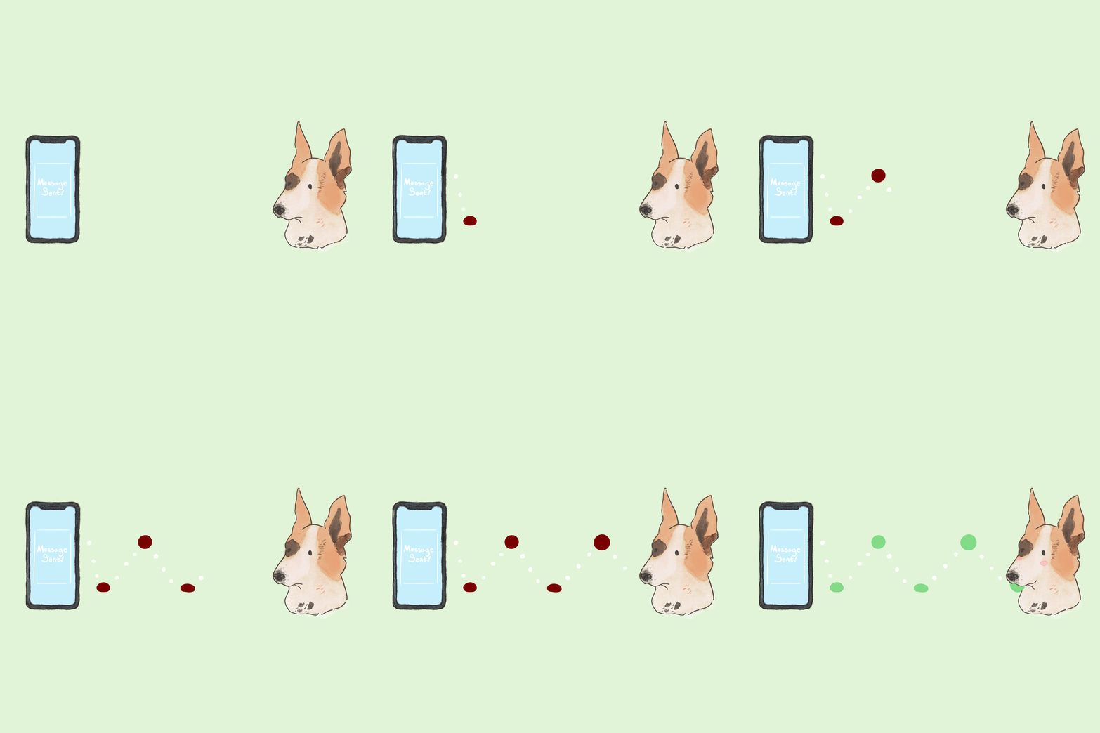
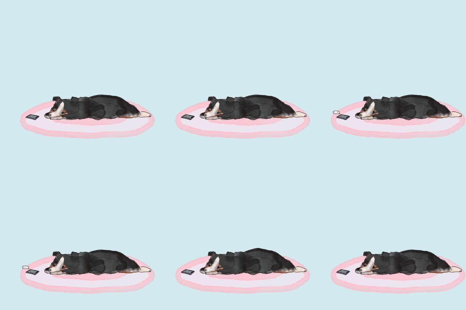
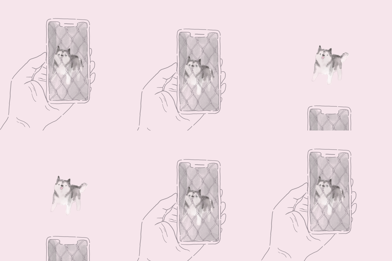
The challenge at hand was how to incorporate this into design. Dogs need us, and we need them, respectively. We count on their support despite not being able even to decipher what they exactly perceive. Being stuck at home during a pandemic can pose varying levels of stir. Having my dogs here with me has helped me keep my head screwed on. Thus my project was dedicated to the emotion dogs bestow us as well as how they help us process our feelings.
Spring 2020

Visual Identity System
I’ve written about witches living in Los Angeles before, I’m also a huge fan of 80s culture. Thus I combined these two aspects to establish a traveling coven that sells poisoned and cursed pastries. Set in the 1980s, Venenum’s mission is revenge upon those who have done others wrong, as they have escaped the Salem Witch Trials and wish to fulfill what they could not. It’s a loaded concept, I know. However designing a system of guidelines and applications served as an opportunity to create an identity holistically, from the ground up.
Fall 2019
Personal Manifesto
Having overcome plenty of medical adversity, I’ve come to the mantra of “this is fine.” The bad in my life as of late is irrelevant to the obstacles of my past. I remind myself that things always get better one way or another. If they’re not better, then it’s not over. Even with the COVID-19 pandemic, despite how anxiously stir crazy I may be, I know that things will return to normal, just a new form of it. Chaos always becomes controlled. So remind yourself not to panic, and remember that “this is fine,” as things could always be worse.
Spring 2019
Personal Publication
A story doesn’t always need words, and even design can attest to that. When it comes to special effects makeup, so much can be accomplished. No need for a script or storyline laid out, the hard work put into one’s face tells the story. In my publication, Two Faced, I analyzed the history of SFX makeup, it’s evolution, and the overall impact it’s had on the motion picture industry.
Fall 2018

Systems of
Los Angeles
A map of one of Los Angeles’ Main necessities: transportation. It focuses on different modes of movement such as Lyft/Uber, the Metro systems, and Bird Scooters. Comments and history regarding the subject matter border the map itself.
Summer 2018

Museum of Neon Art
This project asked me to select my favorite animal, a word associated with said animal, and an establishment that relates to the word. My word was inquisitive, since foxes are rather curious animals. The establishment I chose was the Museum of Neon Art, due to a sense of wonder towards the art of neon. Researching and creating vast iterations with a variety of mediums made this project an in-depth, challenging composition to achieve.
Fall 2017

Console Timeline
A project dedicated to studying the evolution within video game consoles. It shows, specifically, through controllers and their development of more practical, easier to hold designs.
Spring 2017

City Magazine
A magazine cover based on your chosen city. I chose Portland because I was born and raised there. Two very important ingredients came to mind upon starting this project: zombies and bikes.
Fall 2016

Promotional Poster
Poster promoting Vans’ 50th anniversary.
Spring 2016
Typography
Text Based
Album Cover
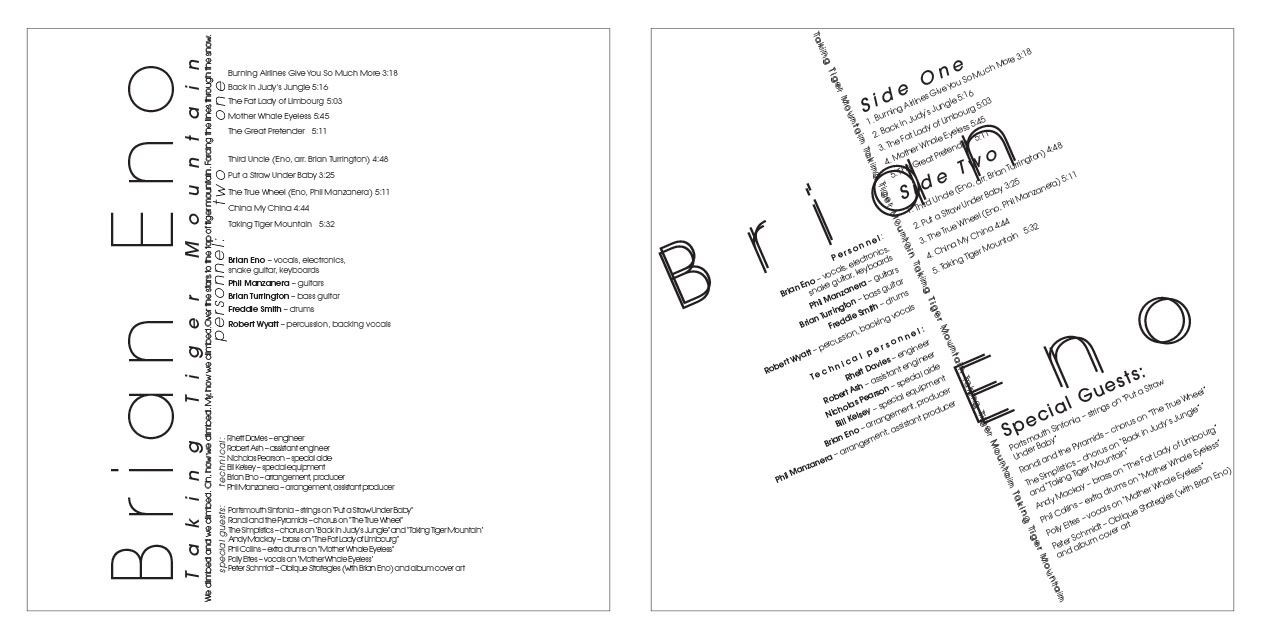
Amongst a list of musical artists, I selected Brian Eno to create a typographically driven album cover. The piece on the left is linear based, while the one on the right is axial based.
Spring 2018
Exercise de Style
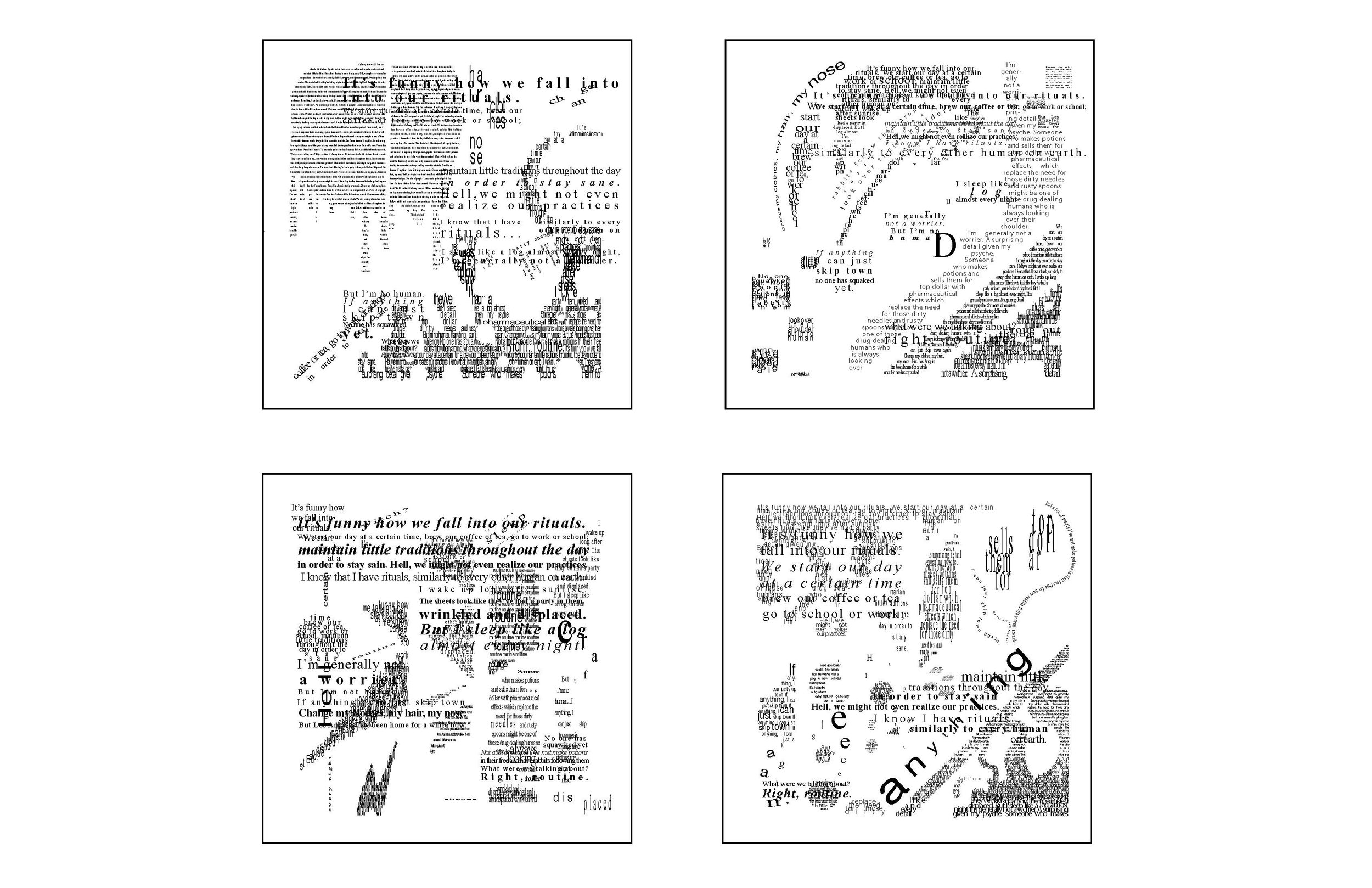
This project began with simply drawing shapes. The next step was to incorporate text into said shapes. Essentially, it was a study of type and as image.
Fall 2017


